Building a Responsive Website with Bootstrap: A Step-by-Step Guide


Developers often ask what is Bootstrap and why it has become a cornerstone in modern web projects. In simple terms, Bootstrap is a front-end framework that helps you create mobile-friendly, professional websites quickly.
As the Developer Product Marketing Manager (PMM) at Froala, I have seen how powerful tools like a bootstrap editor can simplify design tasks. Moreover, our users frequently integrate Froala Editor with Bootstrap for a cohesive workflow.
In this article, I will walk you through how to make responsive website using Bootstrap by showcasing a dog adoption agency website example. You will also learn how to embed Filestack for image transformations and add a Froala-powered comment section.
Below, we will explore several bootstrap responsive website examples in one project. We will cover essential steps — such as creating a sticky navigation bar, building a hero section, adding a carousel, and displaying adoptable dogs in a grid. In addition, we will discuss bootstrap uses, highlight bootstrap coding snippets, and demonstrate use of bootstrap in HTML. Let us dive in.
1. Why Bootstrap Matters
First, you might wonder, “What is bootstrap in web development?” Bootstrap is a collection of HTML, CSS, and JavaScript files designed to streamline the process of creating adaptive, visually consistent websites.
It provides a responsive grid system, pre-built components, and utility classes for styling. Because bootstrap is used for reducing repetitive tasks, developers can focus on functionality rather than spending hours on layout from scratch. Therefore, if you want to learn how to make HTML page responsive, the Bootstrap framework is an ideal starting point.
Furthermore, a bootstrap editor takes things to the next level by providing a drag-and-drop interface for building pages. This approach helps you visualize design changes instantly. However, you can still edit the code directly if you prefer a more hands-on method.
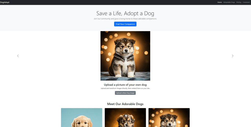
2. Project Overview
Let us build a dog adoption agency website as an all-in-one bootstrap responsive website example. We will include:
Sticky Navigation Bar for easy access to different sections.
Hero Section to introduce the site’s main message.
Carousel to showcase images with Filestack placeholders.
Adoptable Dogs Grid demonstrating bootstrap coding for cards and columns.
Pricing Section for donation tiers.
Filestack Mini-Section to handle uploads and transformations.
Froala Editor snippet to power a “Leave a Comment” form or any rich-text editing scenario.
This structure will illustrate how to make responsive website using Bootstrap in a practical way. Additionally, we will embed Froala, a bootstrap editor for WYSIWYG so that you can see exactly what bootstrap is used for when combined with an advanced WYSIWYG editor.
3. Initial Setup
Below is the basic HTML skeleton you can use. Notice that we have included Bootstrap, Filestack, and Froala scripts. These files enable you to leverage the use of bootstrap in HTML, work with Filestack for images, and embed Froala for content editing:
<!DOCTYPE html>
<html lang="en">

<head>
    <meta charset="UTF-8">
    <title>Dog Adoption Agency</title>
    <meta name="viewport" content="width=device-width, initial-scale=1.0"> <!-- Bootstrap CSS -->
    <link rel="stylesheet" href="https://cdn.jsdelivr.net/npm/bootstrap@5.3.0/dist/css/bootstrap.min.css">
    <!-- Froala Editor CSS -->
    <link href='https://cdn.jsdelivr.net/npm/froala-editor@4.3/css/froala_editor.pkgd.min.css' rel='stylesheet'
        type='text/css' /> <!-- Filestack JS and CSS (Picker, Drag-and-Drop, Transforms) -->
    <script src="https://static.filestackapi.com/filestack-js/3.32.0/filestack.min.js"> </script>
    <script
        src="https://static.filestackapi.com/filestack-drag-and-drop-js/1.1.1/filestack-drag-and-drop.min.js"> </script>
    <script src="https://static.filestackapi.com/transforms-ui/2.x.x/transforms.umd.min.js"> </script>
    <link rel="stylesheet" href="https://static.filestackapi.com/transforms-ui/2.x.x/transforms.css" />
    <!-- Froala Editor JS -->
    <script type='text/javascript'
        src='https://cdn.jsdelivr.net/npm/froala-editor@4.3/js/froala_editor.pkgd.min.js'> </script>
</head>

<body> <!-- Content goes here --> <!-- Bootstrap JS -->
    <script src="https://cdn.jsdelivr.net/npm/bootstrap@5.3.0/dist/js/bootstrap.bundle.min.js"> </script>
</body>

</html>
This starter code establishes a foundation for you to insert various bootstrap coding snippets. You are now ready to create a dynamic page layout.
4. Sticky Navigation Bar
A sticky navigation bar ensures easy site navigation. It remains in view as visitors scroll, making it more convenient to jump between sections. Here is an example:
target="#navbarNav" aria-controls="navbarNav"
            aria-expanded="false" aria-label="Toggle navigation"> <span class="navbar-toggler-icon"></span> </button>
        <div class="collapse navbar-collapse" id="navbarNav">
            <ul class="navbar-nav ms-auto">
                <li class="nav-item"> <a class="nav-link active" aria-current="page" href="#">Home</a> </li>
                <li class="nav-item"> <a class="nav-link" href="#adopt">Adoptable Dogs</a> </li>
                <li class="nav-item"> <a class="nav-link" href="#pricing">Pricing</a> </li>
                <li class="nav-item"> <a class="nav-link" href="#comment">Comment</a> </li>
            </ul>
        </div>
    </div>
</nav>
Notice how sticky-top keeps the nav pinned at the top of your screen. Additionally, .navbar-expand-lg makes the navbar responsive for different device sizes.
A detailed explanation of each bootstrap class:
navbar
A Bootstrap class that applies general navbar styling, including proper padding and font sizing.navbar-expand-lg
Makes the navbar expandable (collapsible into a “hamburger” icon) on screens smaller than thelgbreakpoint (≥992px). Atlgand above, the navbar is fully displayed horizontally.navbar-dark
Applies dark color styles to the navbar text and toggler icon. Typically used with a darker background.bg-dark
Gives the navbar (or any element) a dark background color defined by Bootstrap.sticky-top
Makes the navbar stick to the top of the page when scrolling.container-fluid
Creates a full-width container that spans the entire viewport width, with some left and right padding.navbar-brand
Used specifically for branding (like a logo or name) inside a navbar. It gets specific padding and font-size styling.navbar-toggler
A button class that styles the toggler (the “hamburger” icon) for collapsing the navbar on smaller devices.navbar-toggler-icon
Inserts the default icon (the three horizontal bars) for the collapsible menu button.collapse navbar-collapse
Groups elements (such as the nav links) that will collapse behind the toggler button at small screen sizes.navbar-nav
Wraps the list of navigation links (i.e.,<ul>). Ensures proper padding, alignment, and alignment with the navbar format.nav-item
Applies specific spacing and styling to individual list items in the navbar.nav-link
Styles each link in the navbar for spacing, color, hover states, etc.ms-auto
Utility class that addsmargin-start: auto;(left margin in LTR layouts), pushing the list to the right side.active
Applies an active state styling to the link, often a different color or highlight to show the current section.
5. Hero Section
When visitors arrive, they should immediately see your primary message. Use a hero section to emphasize what your site is about:
<section class="bg-light text-dark py-5">
    <div class="container text-center">
        <h1 class="display-4">Save a Life, Adopt a Dog</h1>
        <p class="lead">Join our community and provide a loving home to these adorable companions.</p> <a href="#adopt"
            class="btn btn-primary btn-lg">Find Your Companion</a>
    </div>
</section>
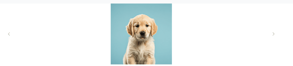
6. Carousel with Filestack Placeholders
Carousels let you highlight multiple images or announcements. By combining Bootstrap’s carousel with Filestack image placeholders, you can dynamically resize or transform images. Replace <YOUR_FILE_HANDLE_#> with actual Filestack handles:
<div id="dogCarousel" class="carousel carousel-dark slide" data-bs-ride="carousel">
    <div class="carousel-indicators"> <button type="button" data-bs-target="#dogCarousel" data-bs-slide-to="0"
            class="active" aria-current="true"></button> <button type="button" data-bs-target="#dogCarousel"
            data-bs-slide-to="1"></button> <button type="button" data-bs-target="#dogCarousel"
            data-bs-slide-to="2"></button> </div>
    <div class="carousel-inner">
        <div class="carousel-item active"> <img
                src="https://cdn.filestackcontent.com/resize=width:1200,height:500/hmzhYgUSZiIA0Ju2ocMo0"
                class="d-block w-20" alt="Friendly Dog 1"> </div>
        <div class="carousel-item"> <img
                src="https://cdn.filestackcontent.com/resize=width:1200,height:500/xsFLOcdRYKQOz4oQpmgg"
                class="d-block w-20" alt="Friendly Dog 2"> </div>
        <div class="carousel-item"> <img
                src="https://cdn.filestackcontent.com/resize=width:1200,height:500/e0DUJOjTjWmUQm0FxL7e"
                class="d-block w-20" alt="Friendly Dog 3"> </div>
    </div> <button class="carousel-control-prev" type="button" data-bs-target="#dogCarousel" data-bs-slide="prev"> <span
            class="carousel-control-prev-icon" aria-hidden="true"></span> <span class="visually-hidden">Previous</span>
    </button> <button class="carousel-control-next" type="button" data-bs-target="#dogCarousel" data-bs-slide="next">
        <span class="carousel-control-next-icon" aria-hidden="true"></span> <span class="visually-hidden">Next</span>
    </button>
</div>
Therefore, this carousel will help you showcase events, success stories, or different adoptable dogs(or depending on your site). By adjusting Filestack parameters, you can customize image dimensions for various screen sizes.
Here’s what each Bootstrap class does:
carousel
Base class for creating a carousel component in Bootstrap.carousel-dark
Applies a darker style to the carousel controls (like prev/next arrows and indicators).slide
Enables sliding animation between items.data-bs-ride="carousel"
An attribute that activates the carousel to start cycling automatically.carousel-indicators
Container for the small clickable indicators at the bottom of the carousel (the dots).carousel-inner
Wraps the carousel items (slides) inside. Only one slide should have the.activeclass at a time.carousel-item
Each individual slide in the carousel. Contains your content (images, text, etc.).active
Marks the currently visible slide in the carousel.d-block
A utility class that appliesdisplay: block;to the element—in this case, ensuring the image acts as a block-level element.w-20
Not part of the default Bootstrap spacing scale (which typically goes up tow-100for 100% width). However, if present, it typically sets the element width to 20%. (This might be a custom or extended utility class. If it’s purely custom, it won’t be recognized as an official Bootstrap class but is often used in a similar pattern.)carousel-control-prev/carousel-control-next
Classes for the previous/next arrow buttons, styling them for the carousel layout.carousel-control-prev-icon/carousel-control-next-icon
Classes for the default icons used for the carousel controls.
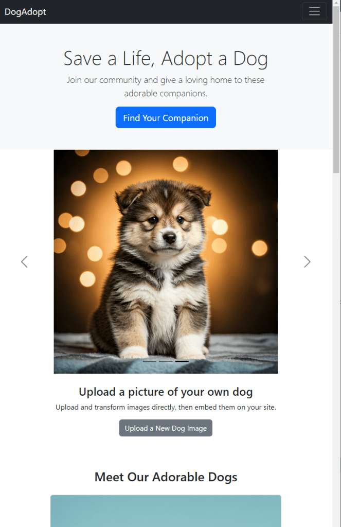
Here’s what it looks like on mobile
7. Add a File Uploader (Optional)
You may want your users to upload new dog photos. Filestack allows dynamic uploads, which are perfect for content that changes frequently. Here is a mini-section to handle this process:
        <section class="py-4 text-center">
    <div class="container">

<h3>Manage Your Dog Photos with Filestack</h3>
        <p>Upload and transform images directly, then embed them on your site.</p> <button class="btn btn-secondary"
            onclick="openFilestackPicker()">Upload a New Dog Image</button>
    </div>
</section>
<script> // Replace 'YOUR_API_KEY' with your Filestack key
    const client = filestack.init('YOUR_API_KEY'); function openFilestackPicker() {
        client.picker({
            onUploadDone: (res) => {
                console.log('Uploaded file handle:', res.filesUploaded[0].handle); // Use this handle to update images in your cards or carousel
            }
        }).open();
    } </script>
dditionally, Filestack handles transformations, security, and content delivery for uploaded images. This means your team can focus on the content rather than complicated upload workflows.
Bootstrap class explanations:
py-4
Adds padding on the top and bottom (vertical) with a spacing scale of 4.text-center
Centers text and inline elements horizontally.container
A fixed-width, responsive container.btn btn-secondarybtn: Base button styling.btn-secondary: Applies the secondary color scheme (a grayish style by default).
8. Adoptable Dogs Section
Next, a grid layout can highlight the dogs that need homes. Bootstrap’s grid system aligns each card responsively:
        <div class="row">
            <div class="col-md-6 col-lg-4 mb-4">
                <div class="card"> <img
                        src="https://cdn.filestackcontent.com/resize=width:1200,height:500/hmzhYgUSZiIA0Ju2ocMo"
                        class="card-img-top" alt="Buddy">
                    <div class="card-body">
                        <h5 class="card-title">Buddy</h5>
                        <p class="card-text">A playful pup who loves belly rubs and afternoon walks.</p> <a href="#"
                            class="btn btn-primary">Adopt Buddy</a>
                    </div>
                </div>
            </div>
            <div class="col-md-6 col-lg-4 mb-4">
                <div class="card"> <img
                        src="https://cdn.filestackcontent.com/resize=width:1200,height:500/xsFLOcdRYKQOz4oQpmgg"
                        class="card-img-top" alt="Lucy">
                    <div class="card-body">
                        <h5 class="card-title">Lucy</h5>
                        <p class="card-text">A gentle soul who gets along with children and other pets.</p> <a href="#"
                            class="btn btn-primary">Adopt Lucy</a>
                    </div>
                </div>
            </div>
            <div class="col-md-6 col-lg-4 mb-4">
                <div class="card"> <img
                        src="https://cdn.filestackcontent.com/resize=width:1200,height:500/e0DUJOjTjWmUQm0FxL7e"
                        class="card-img-top" alt="Max">
                    <div class="card-body">
                        <h5 class="card-title">Max</h5>
                        <p class="card-text">A loyal companion who enjoys fetch and lazy afternoons.</p> <a href="#"
                            class="btn btn-primary">Adopt Max</a>
                    </div>
                </div>
            </div>
        </div>
    </div>
</section>
Here, .col-md-6 col-lg-4 ensures the cards rearrange automatically based on screen size, which helps illustrate how to make HTML page responsive with minimal CSS.
Grid layout classes explanation:
py-5
Vertical padding class (top and bottom), size 5.container
Standard responsive container.mb-4
mbstands for margin-bottom. Adds a bottom margin of scale 4.text-center
Centers the text horizontally.row
Bootstrap’s row container that uses the flexbox grid system. Each direct child with a.col-...class becomes a column.col-md-6 col-lg-4col-md-6: On medium screens (≥768px), the column takes up half the container width.col-lg-4: On large screens (≥992px), the column takes up one-third of the container width.card
A Bootstrap card component that groups content in a bordered box with some padding and a shadow by default.card-img-top
Styles an image to be placed at the top of the card with a specific border radius on corners.card-body
A wrapper class that adds card-specific padding around the content.card-title
Applies specific margin and font-size styles suitable for a card header/title.card-text
Styles the text within the card body (paragraph formatting, margins, etc.).btn btn-primary
Another button example using Bootstrap’s primary color scheme.
9. Pricing Section
Sometimes, adoption centers offer suggested donation tiers or membership perks. A pricing table can make these options more transparent:
<section id="pricing" class="bg-light py-5">
    <div class="container text-center">
        <h2 class="mb-4">Adoption Packages</h2>
        <div class="row">
            <div class="col-md-4 mb-4">
                <div class="card h-100">
                    <div class="card-body">
                        <h5 class="card-title">Basic</h5>
                        <p class="card-text">$50 Donation</p>
                        <ul class="list-unstyled">
                            <li>Initial Checkup</li>
                            <li>Vaccinations</li>
                        </ul> <a href="#" class="btn btn-primary">Adopt Now</a>
                    </div>
                </div>
            </div>
            <div class="col-md-4 mb-4">
                <div class="card h-100">
                    <div class="card-body">
                        <h5 class="card-title">Standard</h5>
                        <p class="card-text">$100 Donation</p>
                        <ul class="list-unstyled">
                            <li>All Basic Perks</li>
                            <li>Pet Insurance (6 months)</li>
                        </ul> <a href="#" class="btn btn-success">Adopt Now</a>
                    </div>
                </div>
            </div>
            <div class="col-md-4 mb-4">
                <div class="card h-100">
                    <div class="card-body">
                        <h5 class="card-title">Premium</h5>
                        <p class="card-text">$150 Donation</p>
                        <ul class="list-unstyled">
                            <li>All Standard Perks</li>
                            <li>Lifetime Vet Support</li>
                        </ul> <a href="#" class="btn btn-warning">Adopt Now</a>
                    </div>
                </div>
            </div>
        </div>
    </div>
</section>
By integrating consistent bootstrap coding for each card, your layout stays clean. On smaller devices, each tier transitions to a vertical stack.
Bootstrap classes explanation:
bg-light
Gives a light gray background.py-5
Adds top and bottom padding with spacing scale 5.container
Responsive container.text-center
Centers text in this container.mb-4
Margin-bottom of spacing scale 4.row
Bootstrap’s grid row.col-md-4
Each pricing column takes one-third of the width on medium screens and up (≥768px).h-100
Forces the card to have a height of 100% of its parent, ensuring uniform column/card heights.card
Bootstrap card component.card-body
Section within a card that applies standard padding.card-title
Styling for card titles.card-text
Styling for card text.list-unstyled
Removes default list styles (bullets, left padding) from the<ul>.btn btn-primary/btn btn-success/btn btn-warning
Different button color schemes from Bootstrap’s default color palette.
10. Adding a Bootstrap Editor WYSIWYG Froala (Optional)
As someone that builds lots of websites. I often emphasize the importance of content editing. Our WYSIWYG solution integrates with Filestack, meaning users can insert and transform images directly. If you want a “Leave a Comment” form, try the snippet below:
<section id="comment" class="py-5">
    <div class="container">
        <h2 class="mb-4 text-center">Leave a Comment</h2>
        <div id="editor"></div>
    </div>
</section>
<script> var editor = new FroalaEditor('#editor', {
        imageEditButtons: ['imageReplace', 'imageAlign', 'imageCaption', 'filestackIcon', 'imageTUI'], filestackOptions: {
            uploadToFilestackOnly: false, filestackAPI: '***', // Replace with your Filestack API key

            pickerOptions: { fromSources: ['local_file_system', 'imagesearch', 'url', 'googledrive', 'facebook'], accept: [".pdf", "image/jpeg", "image/png", "image/webp", "video/*", "audio/*"], transformations: { crop: true, rotate: true } }
        },
    }); </script>
Additionally, if you need more details, check out Froala’s official integration tutorials. A synergy of Froala Editor, Filestack, and Bootstrap reduces manual work and accelerates the development process.
py-5
Adds top and bottom padding (size 5).container
Responsive container.mb-4
Margin-bottom with spacing scale 4.text-center
Centers text horizontally.
11. Putting it all together
<!DOCTYPE html>
<html lang="en">

<head>
    <meta charset="UTF-8">
    <title>Dog Adoption Agency</title>
    <meta name="viewport" content="width=device-width, initial-scale=1.0"> <!-- Bootstrap CSS -->
    <link rel="stylesheet" href="https://cdn.jsdelivr.net/npm/bootstrap@5.3.0/dist/css/bootstrap.min.css">
    <!-- Froala Editor CSS -->
    <link href="https://cdn.jsdelivr.net/npm/froala-editor@4.3/css/froala_editor.pkgd.min.css" rel="stylesheet"
        type="text/css" /> <!-- Filestack JS (Picker, Drag-and-Drop, Transforms) -->
    <script src="https://static.filestackapi.com/filestack-js/3.32.0/filestack.min.js"> </script>
    <script
        src="https://static.filestackapi.com/filestack-drag-and-drop-js/1.1.1/filestack-drag-and-drop.min.js"> </script>
    <script src="https://static.filestackapi.com/transforms-ui/2.x.x/transforms.umd.min.js"> </script>
    <link rel="stylesheet" href="https://static.filestackapi.com/transforms-ui/2.x.x/transforms.css" />
    <!-- Froala Editor JS -->
    <script type="text/javascript"
        src="https://cdn.jsdelivr.net/npm/froala-editor@4.3/js/froala_editor.pkgd.min.js"> </script>
</head>

<style>
    .carousel-inner img {
        margin: auto;

    }
</style>

<body> <!-- Sticky Navbar -->
    <nav class="navbar navbar-expand-lg navbar-dark bg-dark sticky-top">
        <div class="container-fluid"> <a class="navbar-brand" href="#">DogAdopt</a> <button class="navbar-toggler"
                type="button" data-bs-toggle="collapse" data-bs-target="#navbarNav" aria-controls="navbarNav"
                aria-expanded="false" aria-label="Toggle navigation"> <span class="navbar-toggler-icon"></span>
            </button>
            <div class="collapse navbar-collapse" id="navbarNav">
                <ul class="navbar-nav ms-auto">
                    <li class="nav-item"> <a class="nav-link active" aria-current="page" href="#">Home</a> </li>
                    <li class="nav-item"> <a class="nav-link" href="#adopt">Adoptable Dogs</a> </li>
                    <li class="nav-item"> <a class="nav-link" href="#pricing">Pricing</a> </li>
                    <li class="nav-item"> <a class="nav-link" href="#comment">Comment</a> </li>
                </ul>
            </div>
        </div>
    </nav> <!-- Hero Section -->
    <section class="bg-light text-dark py-5">
        <div class="container text-center">
            <h1 class="display-4">Save a Life, Adopt a Dog</h1>
            <p class="lead">Join our community and give a loving home to these adorable companions.</p> <a href="#adopt"
                class="btn btn-primary btn-lg">Find Your Companion</a>
        </div>
    </section> <!-- Carousel (Filestack Image Placeholders) -->
    <div id="dogCarousel" class="carousel carousel-dark slide" data-bs-ride="carousel">
        <div class="carousel-indicators"> <button type="button" data-bs-target="#dogCarousel" data-bs-slide-to="0"
                class="active" aria-current="true"></button> <button type="button" data-bs-target="#dogCarousel"
                data-bs-slide-to="1"></button> <button type="button" data-bs-target="#dogCarousel"
                data-bs-slide-to="2"></button> </div>
        <div class="carousel-inner">
            <div class="carousel-item active"> <img
                    src="https://cdn.filestackcontent.com/resize=width:1200,height:500/hmzhYgUSZiIA0Ju2ocMo"
                    class="d-block w-20" alt="Friendly Dog 1"> </div>
            <div class="carousel-item"> <img
                    src="https://cdn.filestackcontent.com/resize=width:1200,height:500/xsFLOcdRYKQOz4oQpmgg"
                    class="d-block w-20" alt="Friendly Dog 2"> </div>
            <div class="carousel-item"> <img
                    src="https://cdn.filestackcontent.com/resize=width:1200,height:500/e0DUJOjTjWmUQm0FxL7e"
                    class="d-block w-20" alt="Friendly Dog 3"> </div>
        </div> <button class="carousel-control-prev" type="button" data-bs-target="#dogCarousel" data-bs-slide="prev">
            <span class="carousel-control-prev-icon" aria-hidden="true"></span> <span
                class="visually-hidden">Previous</span> </button> <button class="carousel-control-next" type="button"
            data-bs-target="#dogCarousel" data-bs-slide="next"> <span class="carousel-control-next-icon"
                aria-hidden="true"></span> <span class="visually-hidden">Next</span> </button>
    </div> <!-- Filestack Mini-Section -->
    <section class="py-4 text-center">
        <div class="container">
            <h3>Upload a picture of your own dog</h3>
            <p>Upload and transform images directly, then embed them on your site.</p> <button class="btn btn-secondary"
                onclick="openFilestackPicker()">Upload a New Dog Image</button>
        </div>
    </section>
    <script> // Replace 'YOUR_API_KEY' with your actual Filestack API key.
        const client = filestack.init('YOUR_API_KEY'); function openFilestackPicker() { client.picker({ onUploadDone: (res) => { console.log('Uploaded file handle:', res.filesUploaded[0].handle); } }).open(); } </script>
    <!-- Adoptable Dogs Section -->
    <section id="adopt" class="py-5">
        <div class="container">
            <h2 class="mb-4 text-center">Meet Our Adorable Dogs</h2>
            <div class="row">
                <div class="col-md-6 col-lg-4 mb-4">
                    <div class="card"> <img
                            src="https://cdn.filestackcontent.com/resize=width:1200,height:500/hmzhYgUSZiIA0Ju2ocMo"
                            class="card-img-top" alt="Buddy">
                        <div class="card-body">
                            <h5 class="card-title">Buddy</h5>
                            <p class="card-text">A playful pup who loves belly rubs and afternoon walks.</p> <a href="#"
                                class="btn btn-primary">Adopt Buddy</a>
                        </div>
                    </div>
                </div>
                <div class="col-md-6 col-lg-4 mb-4">
                    <div class="card"> <img
                            src="https://cdn.filestackcontent.com/resize=width:1200,height:500/xsFLOcdRYKQOz4oQpmgg"
                            class="card-img-top" alt="Lucy">
                        <div class="card-body">
                            <h5 class="card-title">Lucy</h5>
                            <p class="card-text">A gentle soul who gets along with children and other pets.</p> <a
                                href="#" class="btn btn-primary">Adopt Lucy</a>
                        </div>
                    </div>
                </div>
                <div class="col-md-6 col-lg-4 mb-4">
                    <div class="card"> <img
                            src="https://cdn.filestackcontent.com/resize=width:1200,height:500/e0DUJOjTjWmUQm0FxL7e"
                            class="card-img-top" alt="Max">
                        <div class="card-body">
                            <h5 class="card-title">Max</h5>
                            <p class="card-text">A loyal companion who enjoys fetch and lazy afternoons.</p> <a href="#"
                                class="btn btn-primary">Adopt Max</a>
                        </div>
                    </div>
                </div>
            </div>
        </div>
    </section> <!-- Pricing Section -->
    <section id="pricing" class="bg-light py-5">
        <div class="container text-center">
            <h2 class="mb-4">Adoption Packages</h2>
            <div class="row">
                <div class="col-md-4 mb-4">
                    <div class="card h-100">
                        <div class="card-body">
                            <h5 class="card-title">Basic</h5>
                            <p class="card-text">$50 Donation</p>
                            <ul class="list-unstyled">
                                <li>Initial Checkup</li>
                                <li>Vaccinations</li>
                            </ul> <a href="#" class="btn btn-primary">Adopt Now</a>
                        </div>
                    </div>
                </div>
                <div class="col-md-4 mb-4">
                    <div class="card h-100">
                        <div class="card-body">
                            <h5 class="card-title">Standard</h5>
                            <p class="card-text">$100 Donation</p>
                            <ul class="list-unstyled">
                                <li>All Basic Perks</li>
                                <li>Pet Insurance (6 months)</li>
                            </ul> <a href="#" class="btn btn-success">Adopt Now</a>
                        </div>
                    </div>
                </div>
                <div class="col-md-4 mb-4">
                    <div class="card h-100">
                        <div class="card-body">
                            <h5 class="card-title">Premium</h5>
                            <p class="card-text">$150 Donation</p>
                            <ul class="list-unstyled">
                                <li>All Standard Perks</li>
                                <li>Lifetime Vet Support</li>
                            </ul> <a href="#" class="btn btn-warning">Adopt Now</a>
                        </div>
                    </div>
                </div>
            </div>
        </div>
    </section> <!-- Comment Section with Froala Editor -->
    <section id="comment" class="py-5">
        <div class="container">
            <h2 class="mb-4 text-center">Leave a Comment</h2>
            <div id="editor"></div>
        </div>
    </section>
    <script>
        // Initialize Froala Editor with Filestack integration
        var editor = new FroalaEditor('#editor', {
            imageEditButtons: ['imageReplace', 'imageAlign', 'imageCaption', 'filestackIcon', 'imageTUI'], filestackOptions: {
                uploadToFilestackOnly: false, // Replace with your Filestack API key
                filestackAPI: '***', pickerOptions: { fromSources: ['local_file_system', 'imagesearch', 'url', 'googledrive', 'facebook'], accept: [".pdf", "image/jpeg", "image/png", "image/webp", "video/*", "audio/*"], transformations: { crop: true, rotate: true } }
            },
        }); </script>
    <!-- Footer -->
    <footer class="text-center bg-dark text-white py-3">
        <p>© 2025 DogAdopt. All rights reserved.</p>
    </footer> <!-- Bootstrap JS -->
    <script src="https://cdn.jsdelivr.net/npm/bootstrap@5.3.0/dist/js/bootstrap.bundle.min.js"> </script>
</body>

</html>
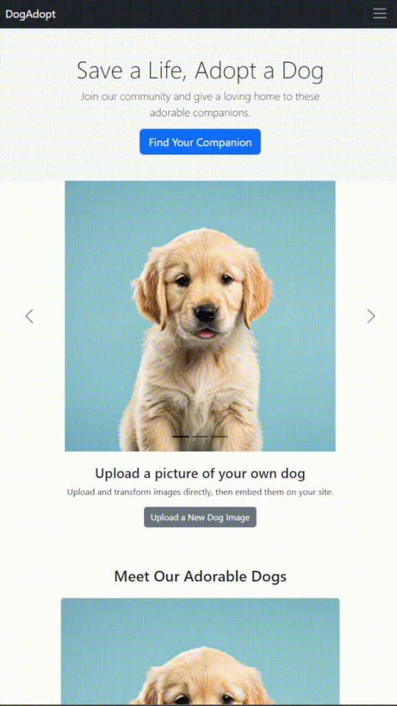
See it in action and what it looks like on mobile:
12. Wrapping Up Your Bootstrap Project
Finally, here is a quick summary:
Bootstrap provides structure, components, and a responsive grid system.
Filestack simplifies image handling, uploads, and transformations.
Froala Editor brings powerful, in-browser content editing to your pages.
A bootstrap editor can further speed your workflow if you prefer drag-and-drop layout design.
By uniting these tools, you can deliver a professional, mobile-ready site in significantly less time. In fact, many developers come back to me saying they never realized how to make responsive website using Bootstrap could be so straightforward. They also discover that pairing a bootstrap editor WYSIWYG like Froala with Filestack offers unique benefits for managing rich media.
This dog adoption agency example demonstrates bootstrap responsive website examples and how they address diverse needs — from content editing to dynamic photo galleries. If you want to master what is Bootstrap in web development, start by creating your own project. Then, incorporate advanced solutions like Filestack and Froala to handle media and text in a modern, efficient way.